
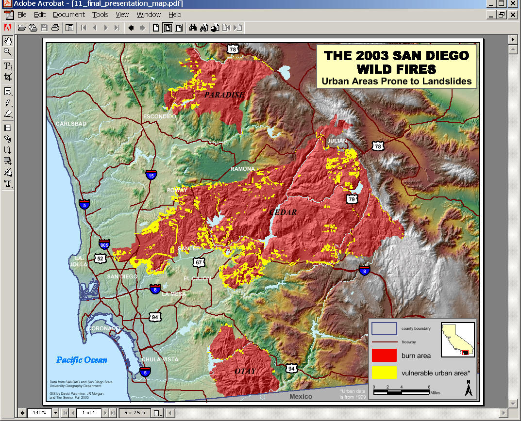
Post fire remediation map
map created by Debbie Kinsinger
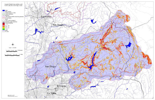
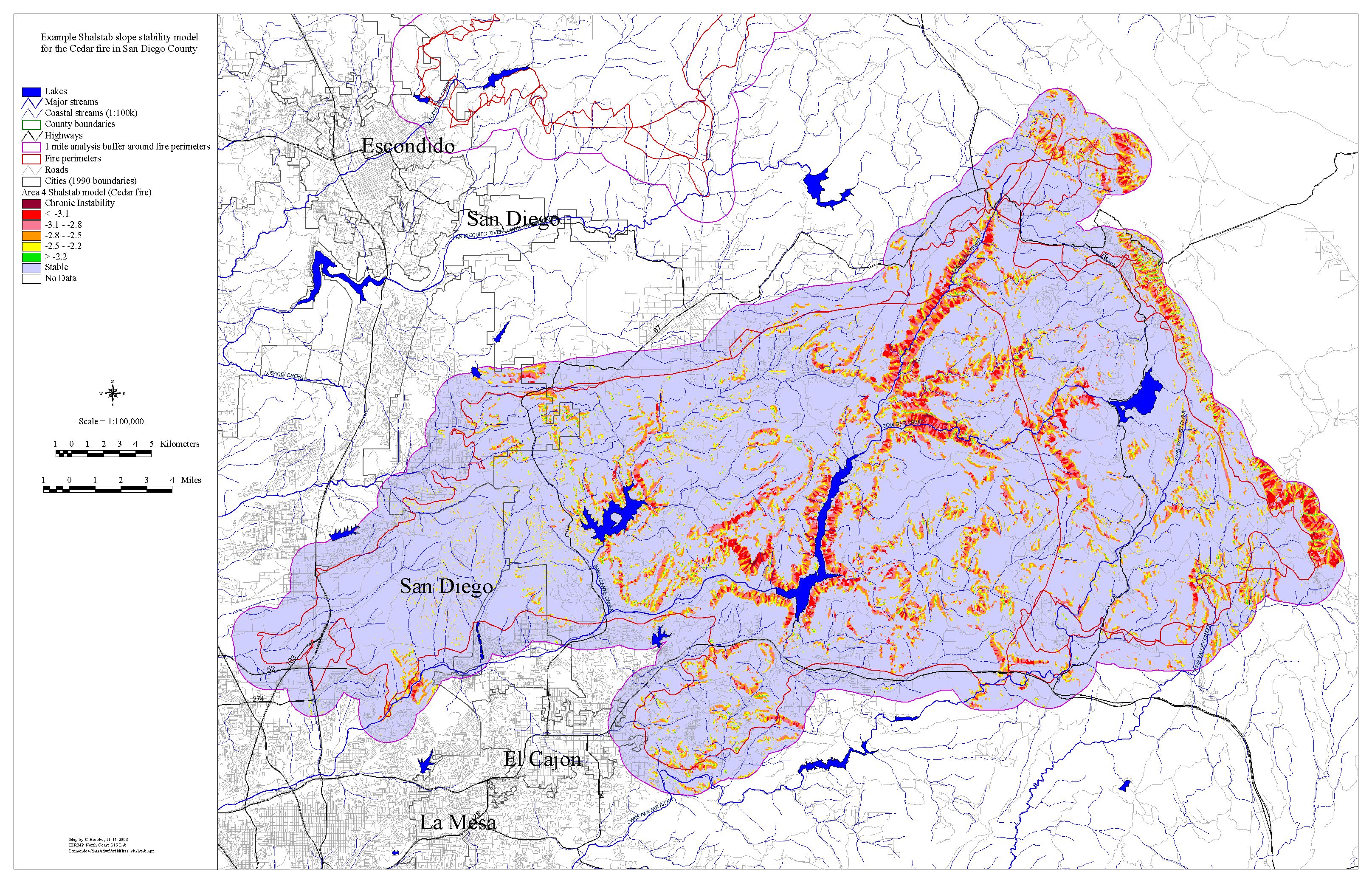
The landslide predictor image here
is a very generic run of the SHALSTAB program, developed by Bill Deitrich and
Dave Montgomery of UC Berkeley, with 30m contour data. It is buffered one mile
beyond the fire perimeter to include most of the fire affected watershed.
Spatial analysis with respect to fire severity mapping and existing slides as
seen from orthophotos can be added. We could do a micro-scale analysis by flying
a two foot contour interval in the priority areas for sediment control
installations. It could be used to optimize design and distribution of in-stream
sediment control structures. We could refine it on the fly with mobile GIS to
support for all the remediation teams.
Click on
the map to see the larger version.
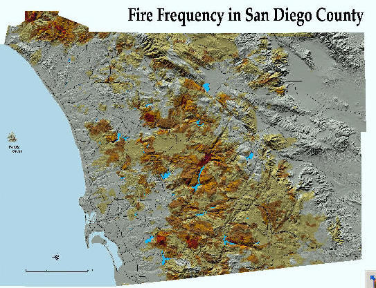
Fire Frequency and Fire History
(created by David Mckinsey
dave@typhoon.sdsu.edu )
Click the following maps to view high-resolution maps (JPEG
format).

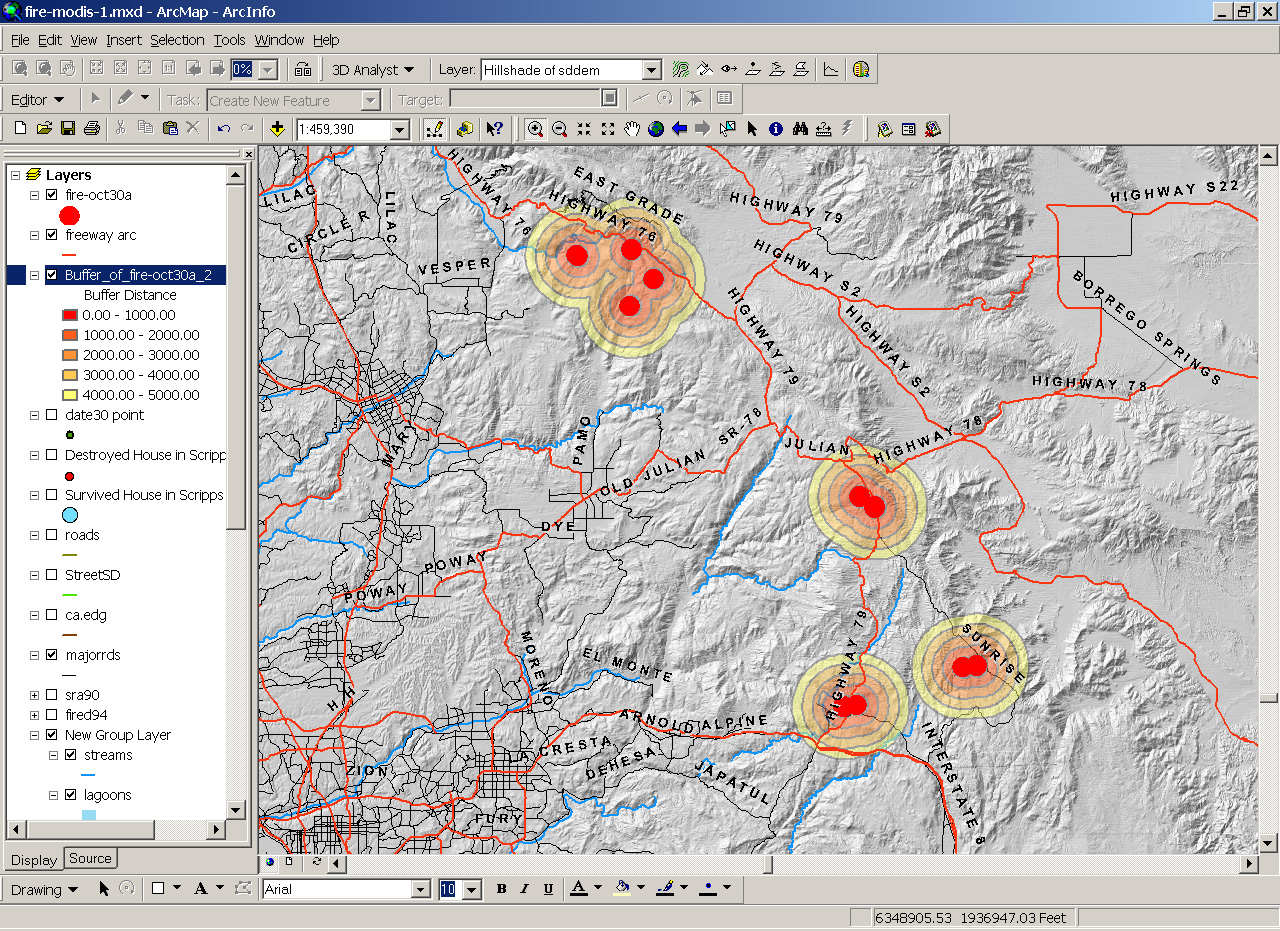
The October 30 Hot Zone area
(Data from MODIS Active Fire Detections (10-30-2003 1:30AM)
created by Ming)
Click the map to see the larger version.
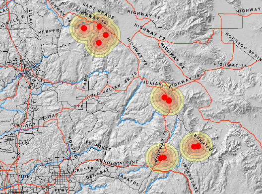
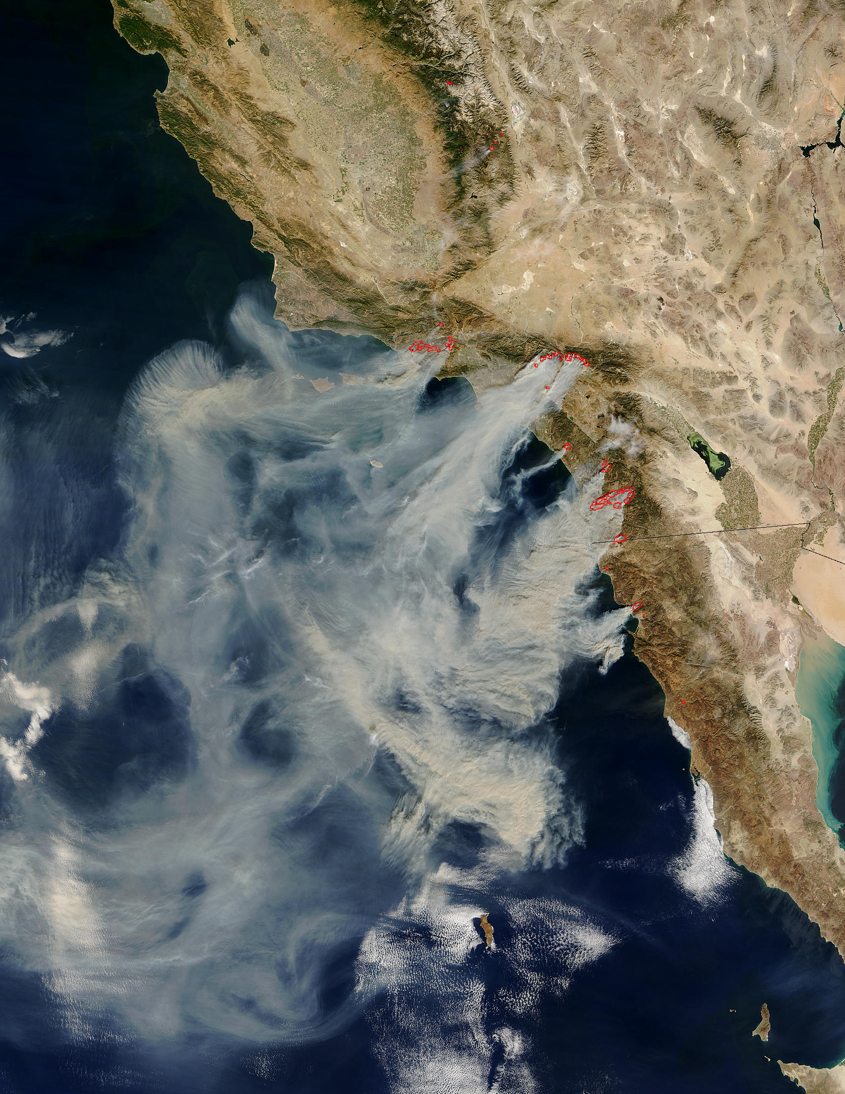
This map is generated by using MODIS Active Fire Detections
for United State (2003-through 10/30/2003). The Red Dot is the hot zone
(currently active fire) and the buffering area is created by GIS software. Each
buffer has 1000 meter distance.
MODIS thermal mapping data over a satellite
image (Oct. 28, 2003)
This map is created
by David F. King (click the map to download the actual PDF map)
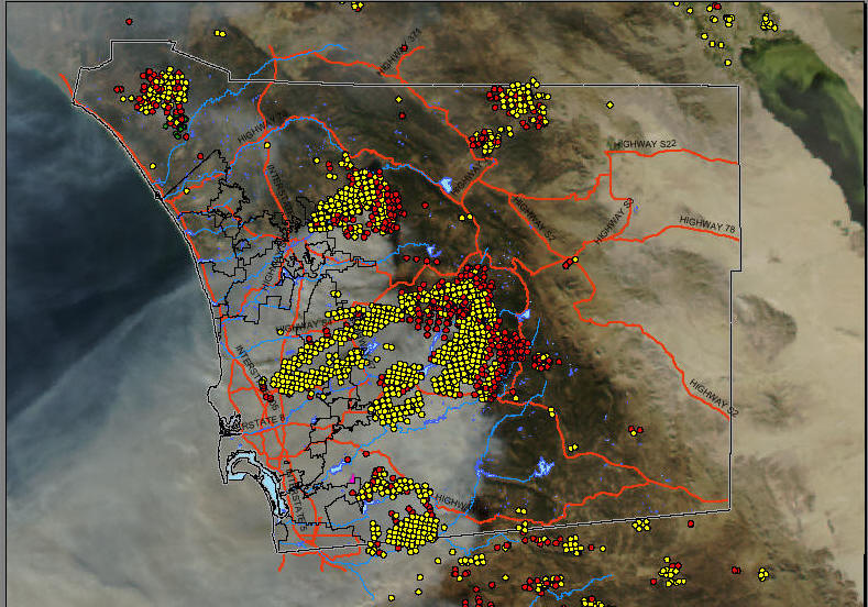
I overlaid MODIS
thermal mapping data over a satellite image of the smoke and fire and added some
landmarks. The MODIS points are attributed by temperature. I wasn't sure where
to make the cutoff, so I used 451 degrees. The red points are probably still
burning, and the yellow points are hot, but mostly 150-300 degrees.
You can see the outline of what had burned as of about 10 this morning. The
other random data on there are various project locations (we were trying to
figure out what burned and what didn't).
David F. King
Senior Biologist
amec Earth & Environmental
5510 Morehouse Drive, San Diego, CA 92121
858-458-9044 x257 858-458-0943 (fax)
Satellite Image of San Diego Area
(October 27, 2003)
(click this image to see the high-resolution image, Date
10-27-2003)
(Data source: NASA website:
http://http://www.nasa.gov/home/index.html
)
Another Satellite Image of San Diego:
http://rapidfire.sci.gsfc.nasa.gov/gallery/?2003299-1026/California.A2003299.1840.721.250m.jpg
(Information provided by Dr. Douglas Stow).
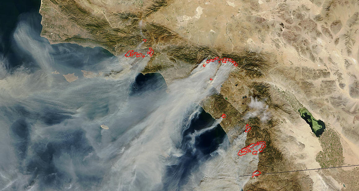
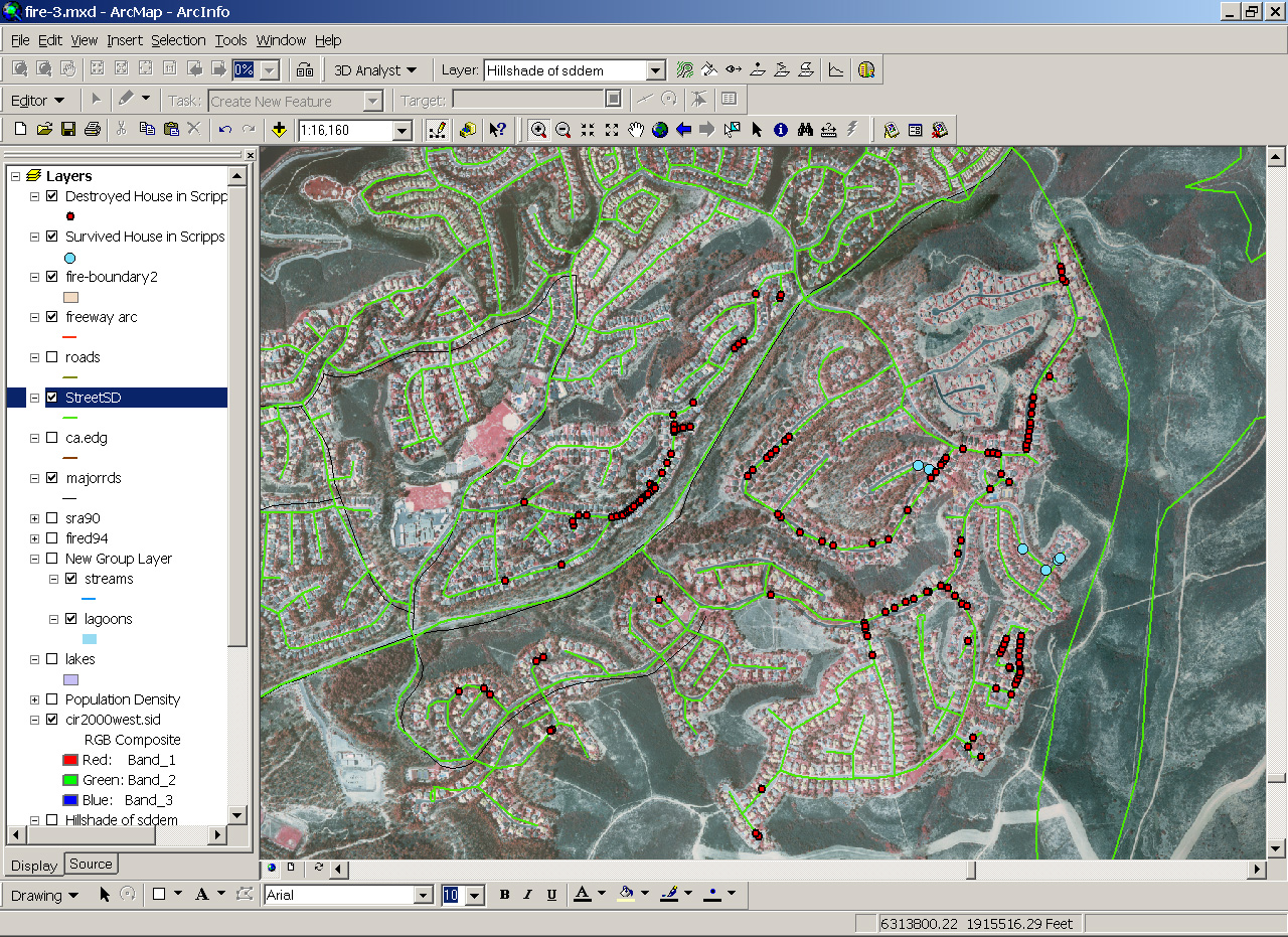
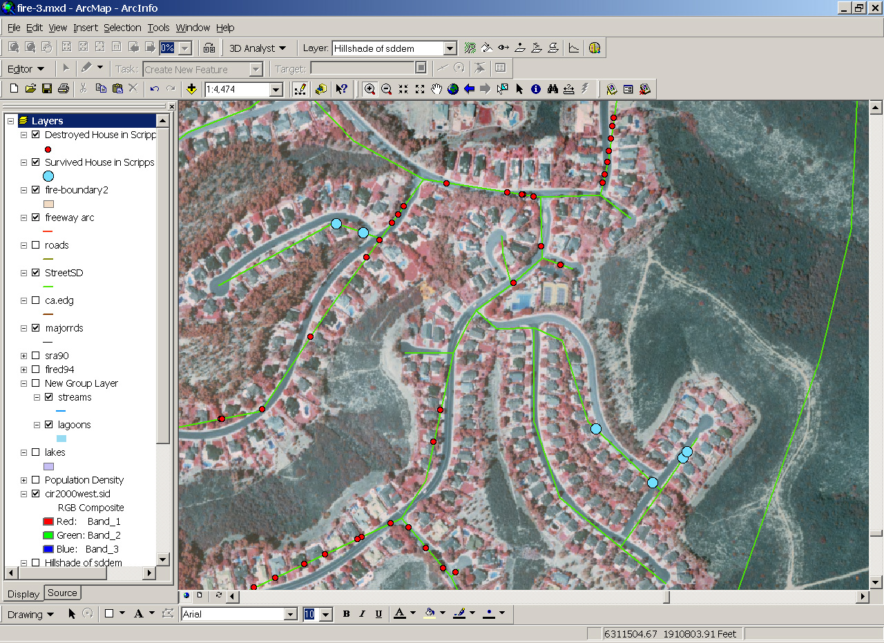
Scripps Ranch Area
The following map is created based on the list of the destroyed
homes in the Scripps Ranch Area. The data source is the Scripps Ranch
Civic Association http://www.scrippsranch.org/
(Oct. 28, 10:23am). The original home addresses have been converted to
points on the map and overlayed with remote sensing images. NOTICE: this is not a complete data
set. Not all addresses have been entered into the GIS database. Only 158 records
(about 70% of total records) have been geocoded
successfully. The RED dots indicate
the destroyed homes and the BLUE dots indicate the
unburned one (All homes destroyed in the same street except the Blue ones).
(These maps may contain some geocoding errors, please use these
maps as preliminary reference only).
(click this image to display large map)
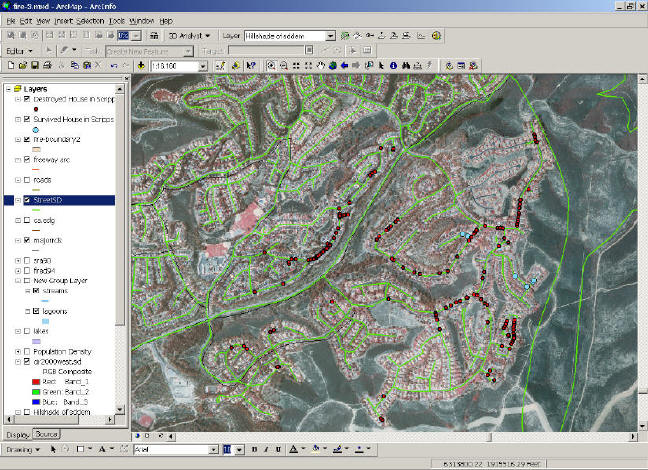
(click this image to display large map)
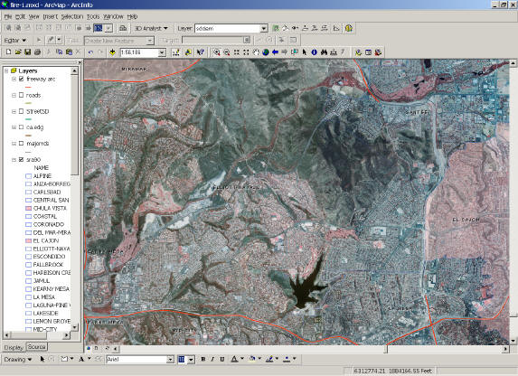
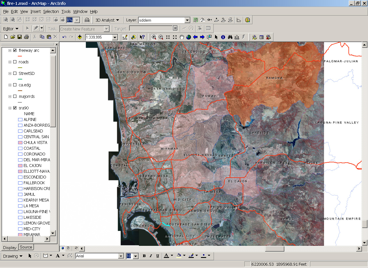
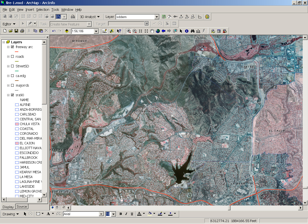
Aerial Photo and Sub-Region Map
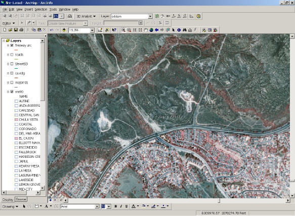
2. Aerial Photo (Zoom In at Mission Trails Regional Park)
3. Aerial Photo (Zoom-In at Visitor Center, MTRP).
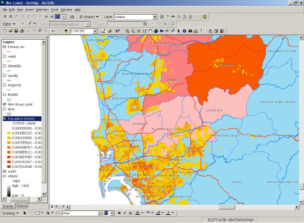
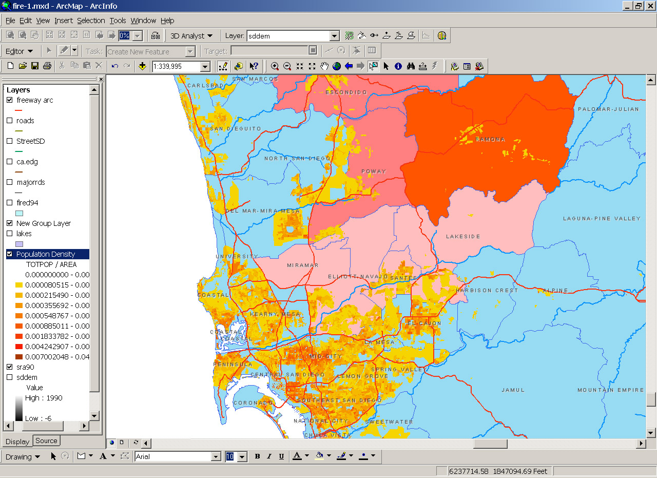
4. Population Density Map.
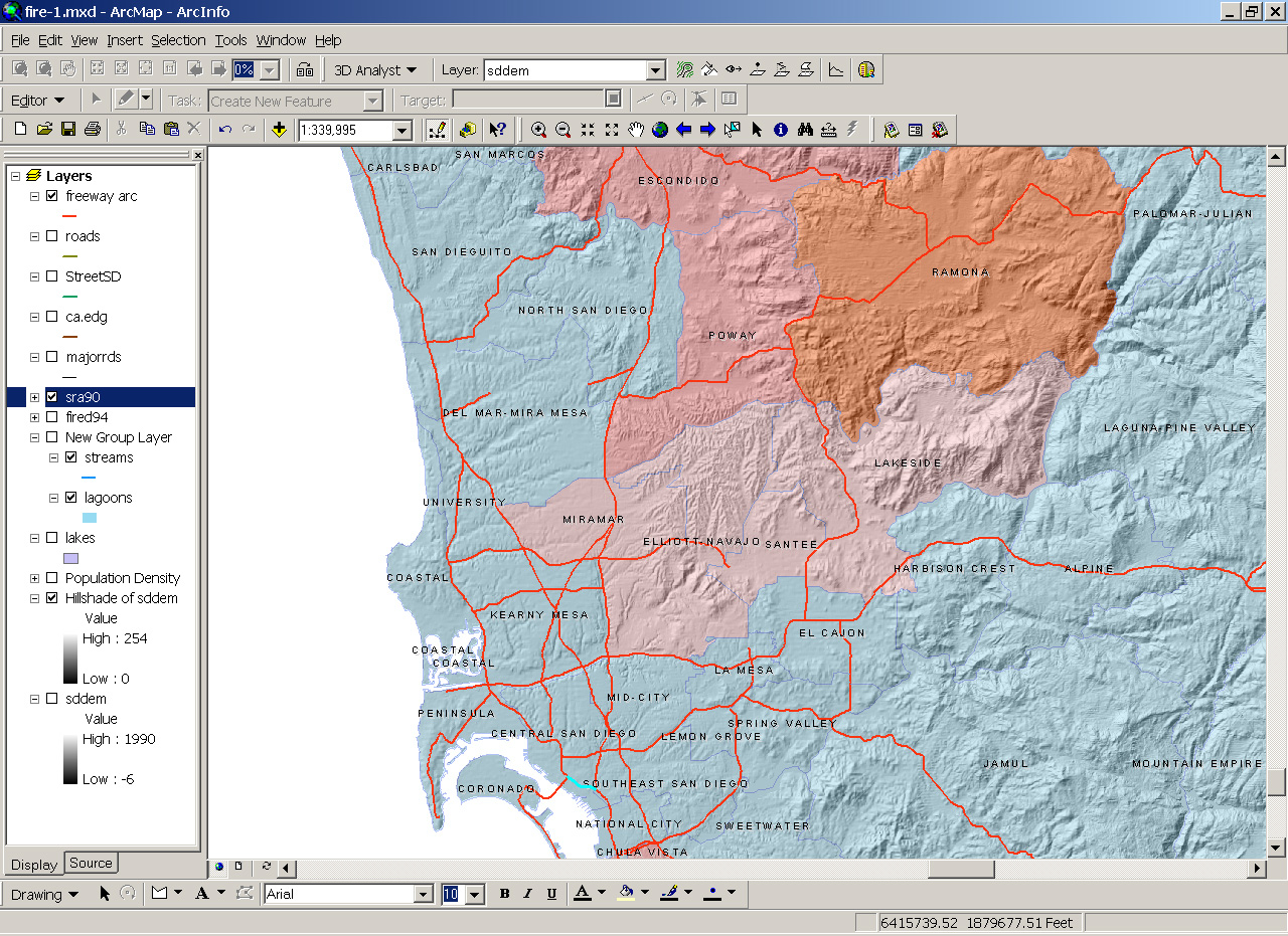
5. Digital Elevation Model with Hillshade

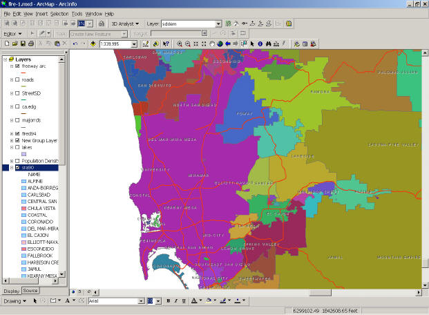
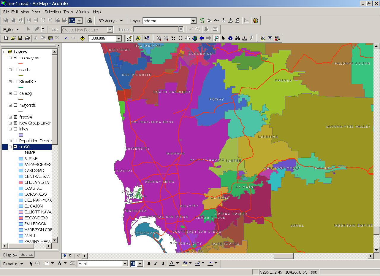
6. Fire District Zone Map.


